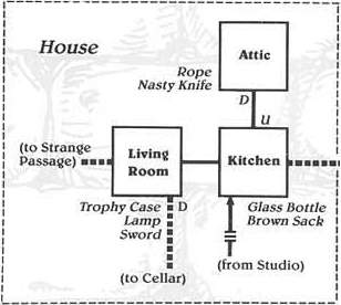
 The other night Colette Bennett, a rather savvy freelance writer that works with us over at TouchArcade, tweeted a link to a Kotaku story entitled “The Delightful Home-Made Maps of the Zork Series.” Now, I won’t belittle my readers by explaining what Zork is, but suffice it to say that, in playing the game, you drew maps. And photocopied them. And shared them with schoolmates on occasion. It was all part of the fun and discovery of quality text adventure, so long ago.
Colette tweeted that the Kotaku piece threw her into a wave of nostalgia. It did, likewise, for me. It’s a lovely piece showing a range of maps from the basic functional to the lavish artistic.
While I’m eager to share this Kotaku story with any that may have missed it, the reason I am posting is to share with readers a hand-drawn game map from my own past. This is not a map that I, myself, drew, but it is a map that I put to rather good and frequent use, way back when. The map I speak of is a map to the classic adventure game Sid Meier’s Pirates!, drawn by my nearly lifelong friend Chris Bernick. (Chris happens to be the backend guy for AppShopper, with a good bit of TouchArcade backend work tossed in here and there.)
Chris is one of those artsy guys — well, perhaps moreso in the past. He did all kinds of drawing when we were in high school — with pencil and paper, airbrush, in Deluxe Paint II on his IIgs, etc. He is the guy who designed the logos for both MacRumors and my old website iPodHacks, as well.
So, Chris had Pirates! on his IIgs and I had just gotten Pirates! on the Amiga. What must have happened was that I lost the map that came in the retail package of the game that I had, earlier, purchased…or…something like that… At any rate, Chris drew (not traced) me a stylized, color map based on the pack-in original. He brought it over to my house late one night (we were neighbors) and, thanks to his handiwork, hours of fun on the high seas did ensue.
And I’ve kept the map all this time.
When I was a kid, arcades were magical places.
They were dark gaming halls lit only by phosphorescence and filled with folks having a white-knuckled good time. The bleeps and bloops emanating from all the cabinets in the room came together in an intoxicating, cacophonous cloud that pleasantly surrounded you. They were where “real” video games lived, games that far outshined whatever approximations you might be lucky enough to have tied to your TV back home.
This is no longer the case, though. Home consoles and PCs grew ever more powerful, and the arcade lost its distinction. It became superfluous. (I consider the Sega Dreamcast home console to have been the final nail in the arcade’s coffin.)
I feel that today, almost without exception, “arcades” are sad and confusing places devoid of a soul. And, so, it is with fond remembrance that I watched an ABC news segment entitled “Video Fever – Games People Play,” broadcast in 1982 by a station in L.A. It was aired at a time when video games were a new, mainstream hot topic, shortly before the crash of 1983.
I saw this video thanks to a post over at Arcade Heroes, which links out to a few other early ’80s arcade videos, as well. What a trip down memory lane!
Coincidentally, shortly after watching the above ABC piece, I ran across a recent story about the most incredible arcade I have ever visited: Remembering the Best — Luna City Arcade. Luna City is — well, was — a wondrous, spacious arcade, filled with around 60 classic cabinets from the ’70s and ’80s, all wrapped in neon ’80s decor. It was also the private collection of one man, Peter Hirschberg.
I first wrote about the Luna City Arcade back in early 2008. I, then, got to know Peter in covering his retro iOS game releases, Adventure and Vector Tanks Extreme, for Touch Arcade. Peter invited me to one of the open-to-the-public “game days” he would hold a few time each year, and I got a chance to drive out to his home (and repurposed garage) about 70 miles west of D.C. and experience his arcade for myself.
And, it just blew my mind. It was probably the most wonderful place I have ever seen — a 60’x40′ patch of heaven.
I captured the above video during the April 25, 2009 game day I attended. Additional glimpses of the event can be seen in my photo set. I covered the trip out to Luna City over at Touch Arcade, but seem not to have posted about it here.
I am sorry to say that the game day I attended turned out to be Luna City’s last, and I count myself extremely fortunate to have been able to experience its wonder. For personal reasons that I won’t get into, Peter has sold the games and the Luna City Arcade is no more.
Sitting down with my morning coffee to start the day, I was greeted by a rather nice tweet from @Time. They tweeted to let us know that Touch Arcade made their list of The 50 Best Websites of 2011.
As readers may be aware, Arnold Kim and I started Touch Arcade in early 2008 to cover what we then felt would obviously be the huge iPhone gaming scene that the upcoming App Store would bring. Looking back, over three years later, we seem to have been rather on the mark with that early assumption.
We ran Touch Arcade as a two-man show for the first year or so, and then began staffing up. We currently have four full-time editors (myself included) and a handful of freelance writers who contribute regularly. The site has, so far, done better than we could have expected and we’ve got some big things in the pipeline for later this year.
I quit my day job of 10 years this past January to focus entirely on the site, and affirmation like this is an honor and really underscores the fact that it was the right decision. (It wasn’t an easy one to make, I can tell you.)
So, thank you Harry McCracken and Time. I promise we’ve no intention of slowing down.
 Some of the greatest enjoyment I get out of the Internet is listening to (or watching) the various podcasts that I’ve come to follow. Most of them, perhaps unsurprisingly, are retro computing themed. In fact, it was a retro computing podcast that got me listening in the first place: Earl Evans’ excellent Retrobits Podcast, which I began enjoying back in 2007.
Earl has recently become involved in another retro computing podcast, the Retro Computing Roundtable, which he hosts, along with David Greelish of The Classic Computing Blog and Carrington Vanston of 1MHz: The Apple II Podcast (another show I enjoy).
The reason for this post is to let readers know, here at the eleventh hour, of a computing history project that the aforementioned David Greelish is working through Kickstarter.
David, computer historian and president of the Atlanta Historical Computing Society, published a zine from 1993 to 1997 entitled Historically Brewed. It garnered 500+ subscribers and was even sold at the Smithsonian and the Computer History Museum in Boston. Nine issues were published, and a tenth issue exists, but never made it to print.
David is seeking funds through Kickstarter to publish all ten issues of his zine together in a compilation book along with a lead-in providing his story, to lend a bit of background to the works. The book, entitled The Complete Historically Brewed, will be about 195 pages in length.
Here’s David with a few words about his project:
While, thankfully, the book is totally funded and then some, this is the last weekend for pre-orders leading up to the initial print run. I wish I had posted this news a month ago, but better late than never. I made my donation this week and have the lovely reservation certificate David sent me hanging on my wall. I can’t wait to get my copy!
Why not order one for yourself?
![]() This is a quick post to share my latest project with readers: at long last, I am learning to type properly!
This is a quick post to share my latest project with readers: at long last, I am learning to type properly!
I got my first keyboard in late 1982. It was connected to my first computer, a TI-99/4A. I began hunting and pecking immediately, of course, and in a few years I had developed a rather bastardized — but fast — method of typing. My personal technique involves using most of my left hand and one finger of my right. It’s a pretty odd thing to witness, but it’s gotten the job done these many years. Using this method, I’m pretty much the fastest typist I know.
So, why mess with things?
I’ve owned many machines over the years, and I can say with assurance that, across those many years, keyboard quality has notably declined, generally speaking. As such, six or seven years ago, I purchased a quality keyboard to use with my main workstation at the time, a Power Mac G5. The keyboard in question was a Matias Tactile Pro (rev. 1) with White Alps key switches. I’ve enjoyed the Tactile Pro greatly, and have lamented not getting the full “experience” out of it, due to my oddball typing technique.
I recently spent some time with Arnold Kim’s Das Keyboard on a trip down to Richmond, VA to work on a Touch Arcade project. I found it to have a nicer feel than the Tactile Pro, and so I ordered one — but with Cherry MX Blue key switches for a bit more of a tactile key response as compared to the Cherry MX Brown “silent” switches in Arnold’s Das. I’ve been using my Das for a few weeks and I love it. In researching the Das prior to purchase, I discovered the geekhack forums and kind-of fell down the keyboard enthusiast rabbit hole. It is there that I learned of the much vaunted Topre key switch.
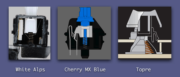
Topre switches consist of a quality rubber dome and a resistive spring cone. The combination results in a pleasantly resistant feel with very smooth motion that lacks the “clack” of many mechanical switches and delivers a satisfying “thock” as the key bottoms out.
As a reviewer over at Overclocker.net described the action,
As you place your finger on the key and push, you are met with a wonderful resistive force almost pushing up at you. As the plunger travels down the shaft to strike the rubber dome, no presence of the spring under it is felt. This results in an incredibly smooth action i can’t stop raving about. Even on the way up, since the potential energy of your stroke is stored in the spring, the force is maintained creating a responsive and fatigue free experience. The feeling of bottoming out is most definitely there and coupled with the sturdiness of the case, really makes it fun to type on.
In the world of gourmet keyboards, the Topre key switch is widely considered to be the Holy Grail. Some have even made love to their Topre’s… Only two keyboards on the market utilize this apparently magical switch: the Happy Hacking Professional 2 and Topre’s own Realforce line. Unfortunately they are all very expensive keyboards that are often difficult to obtain. And, I say “apparently,” as I’ve never used a Topre keyboard — it’s not like you can just walk into a Staples and try one out.
(Geekhack has posted a highly informative Mechanical Keyboard Guide for those wanting to learn more about key switch technology.)
And so, after reading rave after rave (and watching demo video after demo video) about Topre switches — and despite having just purchased this excellent Das Keyboard — I have just ordered a Realforce 87U Tenkeyless, which lacks a physical numeric keypad and features black characters on dark grey keys. Most indications are that it is the best keyboard on the market today.
Having decided to place such exquisite keys beneath the tips of my fingers, it seems only appropriate to do them honor by getting all of my fingers into the mix. I recently spent significant time across two days working through a typing tutor app, which successfully got the entire keyboard into a new part of my brain, and from there, have been typing everything “properly” — and slowly — with eyes fixed on the screen. The whole thing is easier than I thought it would be, and my speed is slowly increasing. I’m three full days into it right now. Oh, and I’m 39 years old, which probably makes this an old dog, new tricks sort of experiment. It’s painful, but going pretty well…and making this public post should help keep me from giving up.
I’ll post a followup after the Realforce arrives and I’ve spent more time under the proper technique. Stay tuned!
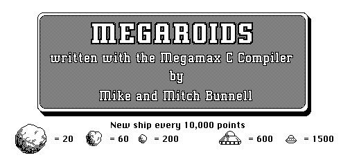
In my opinion, Asteroids is one of the very best videogames of all time. I guess that’s probably obvious. Lately I’ve been playing a related series of Asteroids-inspired games that are old enough to be considered retro, themselves. They were pretty popular back in the day, and you’ll hear about that in a post, here, soon enough. But my favorite Asteroids remake of all time is a game far fewer will have heard of. It’s a game I spent a lot of time with this past Christmas, as well as during the Christmas of 1986, 25 years ago.
That game is Megaroids, by Mike Bunnell, with audio by his brother Mitch.
Megaroids was released in 1984 for the Macintosh by Mike Bunnell, then of Megamax. It was bundled with the Megamax C compiler, as an example of what the system could do. (The source code was available for a small fee.) When the compiler was released for the Atari ST in 1985, Megaroids was ported and bundled with it, as well. And, for a while, Atari included the game as a pack-in title with the early Atari ST systems, which is how I first came to know it.
I’ve played the Mac version a few times — I’ve got it on my Mac Plus right now. But it was the Atari ST version I fell in love with. The game was unusual in that, on color ST systems, it was rendered in the “Medium Res” mode, at 640×200 pixels in four colors. But, interestingly, the developer employed some manner of frame swapping that sought to increase the apparent resolution by rapid color switching, while introducing some flicker. It made the game look pretty outstanding on a color Atari ST. The 640×400 “High Res” monochrome mode was also supported on the ST, for those with an SM-124 display.
A few months back I captured some video of the game running under an emulator on my Windows 7 box (though I prefer playing it on the real thing). Have a look.
Knowing I’m close to posting my other Asteroids-related story, I wanted to go ahead and share this one, to prime the pump, so to speak. Shortly after capturing the above video, I located Mike Bunnell, who’s presently CEO of Fantasy Lab, and shared the piece with him. He seemed pleased for the stroll down memory lane.
UPDATE (7/2011): In my email back-and-forth with author Mike Bunnell, he spoke to the effect he used in the ST’s medium res mode to increase the apparent screen resolution. Most interesting.
“BTW I see you mentioned my technique for increasing the apparent resolution of the medium res mode on the atari st. I made use of the fact that the monitor really had 400 lines of resolution, but the scanning was interlaced (like a tv), first displaying the even lines of a frame and then the odd lines. In 640×200 mode the Atari scans from the same frame buffer location for the even and odd lines, effectively halving the top resolution of the monitor in order to provide a better looking (non-blinking) GUI. Megaroids made use of the full resolution of the monitor by rendering a different image for the even lines and the odd lines.”
UPDATE (08/2011): I’ve been playing with DOSBox on the PC, looking for EGA games and ran across EGA-roids, a ‘286 EGA conversion of Megaroids! See the game in action.
UPDATE (10/2015): I’ve been making custom watch face images for my 42mm Apple Watch running watchOS 2.0 and one of the faces I made is a tribute to Megaroids. Whaddaya think?
 I remember sitting at home on the floor in front of the TV, in the house where I grew up in Yorktown, VA at 7 a.m. EST on April 12, 1981. That morning, my family and I sat there in excited wonder as we watched the space shuttle Columbia, the world’s first reusable orbital spacecraft, leap off of Launch Pad A at the Kennedy Space Center in Florida. So many reading this post have lived with Shuttle flights taking place throughout their entire lives that it may be hard to imagine what an incredible event this was, to those experiencing it. I was just eight years old, at the time, and it was mind-blowing, to me.
The launch of the STS-1 mission took place exactly 20 years after the the Russian Vostok 1 took cosmonaut Yuri Gagarin aloft on what was the first manned spaceflight. And, here 30 years after Columbia‘s maiden voyage into space, I have just watched (from the couch this time) the launch of the Space Shuttle Atlantis, kicking off the STS-135 mission, the last mission in the Space Shuttle program.
Due to a number of factors, not the least of which is expense, once Atlantis touches down at the Kennedy Space Center twelve days from now and the STS-135 mission draws to a close, the Space Shuttle program will be no more. And, given the lack of a any real replacement program, I find this to be a sad day.
A launch vehicle — a capsule of sorts — is set to be ready to take personnel and supplies to the International Space Station in 2015, but it’s nothing so grand as the mighty Space Shuttle we’ve known these 30 years. Private low Earth orbit ventures will join the effort while NASA focuses on the farther reaching goals of the moon, asteroids, and Mars — but this will certainly take considerable time.
I feel sure that in my daughter’s lifetime, she will come to know a phase of the space program as exciting as the Shuttle program has been to me all these years, but I fear that I will not again have the opportunity to cheer on so mighty a new endeavor in my remaining years. Still, I have the highest hopes and excitement for the future of human space exploration, in whichever form it takes. And, I know that my father, who spent his 35 year aeronautical engineering career with NASA, shared that sentiment his entire life.
Here’s to the future and the heavens above.
 So, the big news of the week has been Google+, the search giant’s latest stab at the social network thing. I was lucky enough to get an invite early on and, I must say, I’m liking the service so far. (Here’s my Google+ profile link.) If you took Facebook and removed everything MySpace about it, and slathered it in Apple-class interface goodness, you pretty much get Google+. Twitter is by far my main social Internet thing, though I do use Facebook lightly, but have never liked the feel of it, and its feel has been going downhill for quite some time, in my opinion. I’m quite interested to see how my use of and feelings for Google+ will evolve as more people get on board.
The purpose of this post is to share something I saw on my Google+ stream earlier today that fascinated me. Andy Hertzfeld, who joined the fledgling Macintosh team at Apple in 1981 and became the primary software architect of the original Macintosh operating system, is on Google+. (I added him to my Circles!) But, what I didn’t know is that he works for Google and, what’s more, he contributed heavily to the creation of Google+ itself.
I just saw this modest post by Hertzfeld appear in my stream, where he thanks users for their positive reaction to the new service and clarifies his role in the system. I will quote part of it here.
It’s great that the user experience of Google Plus is being so well received, and I’m happy about all the positive feedback that’s been coming my way, but I’m worried that I’m getting too much credit for it, so this long-winded post is an attempt to set the record straight.
I am indeed the main individual behind the interaction design and implementation of the circle editor. I conceived, designed and implemented a compelling prototype for it almost single-handedly, and then wrote a fair percentage of the production javascript code with lots of help from my friends. I also worked on a couple of other parts of the product a little bit, but that’s pretty much as far as it goes.
Steven Levy’s excellent Wired article got the story right – I wrote the circle editor and then recently widened my focus to the overall Google Plus user experience. But subsequent stories jumped to the conclusion that I was responsible for the design of the entire product that we launched on Tuesday, which isn’t true, but I guess it was just too good a story (about Apple design values infecting Google) for people to resist. And now some people are saying that I’m responsible for the broad visual refresh now rolling out across Google, which couldn’t be further from the truth – in fact, I’m not even sure I like it.
 A core feature of Google+ is the Circle system. It’s a way of grouping friends, acquaintances, and even strangers into logical bins, which can be used individually or in a combined manner to easily get your thoughts to whatever audience you desire. Family news to relatives, tech discoveries to your geek crowd, work items to officemates, etc. And, a huge part of Circles is the impressive, in-browser visual manager that lets you drag and drop folks hither and yon. It’s certainly the most striking thing about Google+, and it looks like the man who brought us the Macintosh interface so long ago is the man behind the Circle editor.
And, at Google, he even kept his old Apple job title: “Software Wizard” !
I wanted to share this, as I count Andy Hertzfeld among my short list of heroes, and it’s great to see him still sharing his magic with the rest of us. Be sure to visit his excellent Folklore.org, a trove of anecdotes from the genesis period of the Macintosh.